Presentation and
Visualization Methods for different industries
After studying the basics of
dimensional modeling and exploring various Business Intelligence tools, I felt
the need to explore the differences in visualization methods for various
industries. In this blog post, I will be talking about the different techniques
and methods for presenting data in 3 different industries – retail, healthcare
and e-commerce. All these industries are very different and have different KPI
(Key performance indicators) to focus on. This leads to different data
Retail
For the retail industry, the main
drivers of the business are product sales, customer relationship and inventory
management. The analysts working on retail sector usually focus on these 3
segments of the business to know how well the company or the industry (as a
whole) is doing.
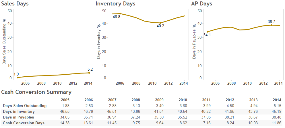
Below is an example of a
dashboard for a retail company

The 3 parameters measured here
are sales days, inventory days and Accounts Payable days. Here, the parameters
are compared for the same company over the last 8 years. From the graphs, we
can see that the values for these 3 parameters hasn’t changed much over the
years. Although there were temporary ups and downs, the overall values have
little changes. If this were the graph for the whole industry, we might be able
to deduce that operationally, the industry is very stable and there are no
major factors affecting the industry. Here, we have compared the parameters
over the years. We can also compare the parameters of one firm against that of another
firm within the same industry. In that way, we would be able to say if a firm
is competitive within the industry or not. It is a totally different outcome
altogether.
Here, we have a line chart to visualize
the movement of these critical factors over the years. If it were comparison
between 2 companies for the same parameters, we could have used the bar chart
or use the line chart. When we use the line chart, we just want to see the
pattern. But when we use the bar chart, we want to look at how 1 firm stacks up
against another.
Healthcare
For the healthcare segment, the primary KPI to focus on are clinical, operational and financial metrics. Today, the healthcare costs are spiraling in US. Hence it is very important to keep checking these parameters regularly.
For the healthcare segment, the primary KPI to focus on are clinical, operational and financial metrics. Today, the healthcare costs are spiraling in US. Hence it is very important to keep checking these parameters regularly.
One of the possible dashboards
for a healthcare firm would look like

If you compare the graphs for the
healthcare with the graphs of retail, we find that even-though the parameters
are compared over the years, they have been represented in different ways for
both industries. Here, similar data is shown as bar chart and volume graph.
Through these graphs, the hospitals can analyze values for a particular year as
compared to its peers. Here, the focus is not too much on trend as is on
comparing it with neighbors. Also, if we look at the graphs of monthly
mortality rate or nursing workload analytics, we find that the focus is on
percentage of total. There is an upper limit here that should not be crossed.
The more closer a hospital/clinic is to the upper limits, the more dangerous it
is to manage them – financially as well as operationally.
Electronic Commerce
Since the inception of Amazon,
the world of retail has changed for good. The retail metrics are no longer
restricted to pure store sales. Concepts like multi-channel sales, online
advertising, google analytics etc. which were never thought of as important before
have suddenly become main-stream now.

The figure here is an example of
goggle Analytics dashboard. Here, the data is being compared to other
substitutes for the same parameter. Because we know all the possible substitutes
in the universe, we are using a pie chart to represent the percentage sales for
a particular device (for example: iPad vs iPhone) or percentage sales per
channel. For specific numbers important for the analysts/management, the data
is directly represented in a table.
In general, any information can
be represented in a table format. But the visualization will be decided based
on purpose of the metric and how you intend to measure the KPI.
References: